
[et_pb_section bb_built=”1″ admin_label=”section” _builder_version=”3.0.66″ transparent_background=”off” allow_player_pause=”off” inner_shadow=”off” parallax=”off” parallax_method=”on” make_fullwidth=”off” use_custom_width=”off” width_unit=”on” make_equal=”off” use_custom_gutter=”off”][et_pb_row admin_label=”row”][et_pb_column type=”4_4″][et_pb_image admin_label=”Image” _builder_version=”3.0.66″ src=”https://rothstokes.com/wp-content/uploads/2016/05/AMP-main-image-01.jpg” show_in_lightbox=”off” url_new_window=”off” use_overlay=”off” sticky=”off” align=”center” always_center_on_mobile=”on” border_style=”solid” force_fullwidth=”off” animation=”off” use_border_color=”off” border_color=”#ffffff” /][et_pb_text admin_label=”Title” background_layout=”light” text_orientation=”left” use_border_color=”off” border_color=”#ffffff” border_style=”solid” header_font=”Droid Serif||||” text_font=”Droid Serif||||” text_font_size=”18″ header_font_size=”46px” custom_padding=”20px|||”]
Why Your Mobile Site Needs Google AMP
[/et_pb_text][et_pb_text admin_label=”Byline | Date” _builder_version=”3.0.66″ background_layout=”light” text_orientation=”left” text_font=”Roboto Condensed||||” border_style=”solid” text_letter_spacing=”2px” custom_padding=”13px|||” use_border_color=”off” border_color=”#ffffff” saved_tabs=”all”]
by MATT STOKES | MAY 6, 2016
[/et_pb_text][et_pb_text admin_label=”Text” background_layout=”light” text_orientation=”left” use_border_color=”off” border_color=”#ffffff” border_style=”solid”]
Studies show that 40% of people browsing the internet on their phones will leave a website if it doesn’t load within three seconds. Three seconds! That’s why it’s so important to optimize your site to load quickly on mobile phones.
The problem is that much of the web is still stuck in the pre-smartphone era. Websites designed for desktops, with their slideshows, ads, and sidebars, struggle to fit onto a small screen. What’s more, web developers usually load other elements onto the page that the user can’t see, such as tracking codes to determine how the user found the site. All of this clutter makes the page even slower and clunkier to use on a phone than on a computer.
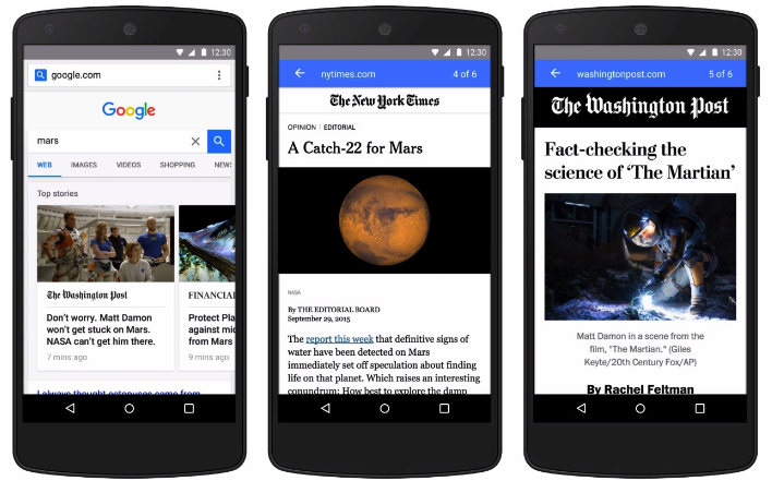
Clearly then, optimizing your site for mobile use is absolutely crucial. To help web developers, Google has rolled out a project called Accelerated Mobile Pages, or Google AMP. AMP is, essentially, HTML code that web developers add to each page on their site to make the page’s content load almost instantaneously on a mobile device—think of it as creating an instant “printer-friendly” page for users.
AMP is an “open-source” project, which means that it is free for users and dependent on users to add to and manage it. Learning how to incorporate it into your website is important not just because you want your users to have the best experience visiting your website, but because Google will prioritize sites that are AMP-optimized in its search results. In other words, if you don’t optimize your site for AMP, your site could lose traffic because it could fall beneath AMP-optimized sites in the results of a Google search.
As mobile becomes the dominant way we consume the internet, staying on top of mobile optimization trends has never been more important.
[/et_pb_text][/et_pb_column][/et_pb_row][/et_pb_section]