[et_pb_section bb_built=”1″ admin_label=”section” _builder_version=”3.0.66″ transparent_background=”off” allow_player_pause=”off” inner_shadow=”off” parallax=”off” parallax_method=”on” make_fullwidth=”off” use_custom_width=”off” width_unit=”on” make_equal=”off” use_custom_gutter=”off”][et_pb_row admin_label=”row” background_position=”top_left” background_repeat=”repeat” background_size=”initial”][et_pb_column type=”4_4″][et_pb_image _builder_version=”3.0.66″ src=”https://rothstokes.com/wp-content/uploads/2017/07/Symbolism-Main-image-01.jpg” show_in_lightbox=”off” url_new_window=”off” use_overlay=”off” sticky=”off” align=”center” always_center_on_mobile=”on” border_style=”solid” force_fullwidth=”off” animation=”off” use_border_color=”off” border_color=”#ffffff” /][et_pb_text admin_label=”Title” background_layout=”light” text_orientation=”left” use_border_color=”off” border_color=”#ffffff” border_style=”solid” header_font=”Droid Serif||||” text_font=”Droid Serif||||” text_font_size=”18″ header_font_size=”46px” custom_padding=”20px|||” module_alignment=”left” background_position=”top_left” background_repeat=”repeat” background_size=”initial”]
Things to Consider When Making a Logo Symbol
[/et_pb_text][et_pb_text admin_label=”Byline | Date” _builder_version=”3.0.66″ background_layout=”light” text_orientation=”left” text_font=”Roboto Condensed||||” border_style=”solid” text_letter_spacing=”2px” custom_padding=”13px|||” use_border_color=”off” border_color=”#ffffff” module_alignment=”left”]
by LACI ROTH | JULY 14, 2017
[/et_pb_text][et_pb_text background_layout=”light” header_font=”Droid Serif||||” text_font=”Droid Serif||||” text_font_size=”18″ border_style=”solid” module_alignment=”left” background_position=”top_left” background_repeat=”repeat” background_size=”initial” _builder_version=”3.0.77″]
My latest logo project was for a new organization called A to Z Consulting & Advocacy. Since the concept of “A to Z” has been used in many businesses and organization logos I wanted to be sure I gave this symbol plenty of thought to ensure its uniqueness.
Things I consider when formulating a new idea:
- What’s been done before with similar components?
- What is special about this company—what is the company’s essence?
- How can I keep the overall look simple but impactful?
It’s important that all of the components used in a logo serve a symbolic purpose. This means not using shapes, swooshes, and lines that don’t help convey the company’s message or brand.
My client’s wish list:
- Use the “A” and “Z” in the symbol in some way
- Find a way to convey the ideas of “progress” and “a path forward” as these concepts are fundamental to the organization
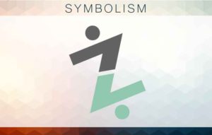
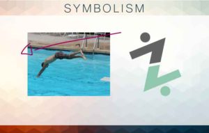
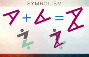
The final logo symbol:
I’ve used two letter A’s to form a Z. The A’s also serve as arrows showing movement. By adding circles on either side of the Z, I was able to create to figures who appear to be using each other to help both figures propel forward.
[/et_pb_text][/et_pb_column][/et_pb_row][/et_pb_section]